|
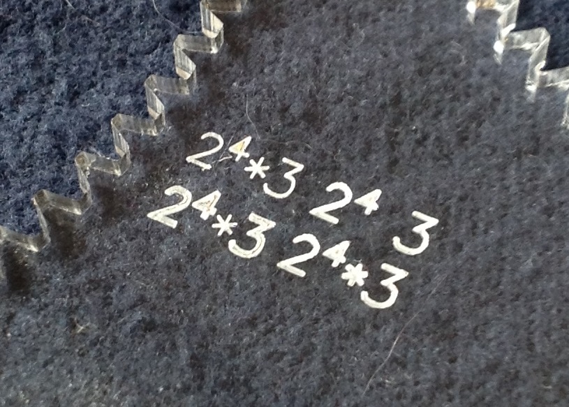
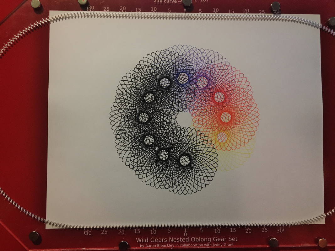
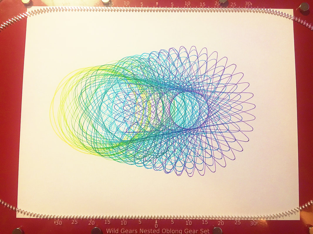
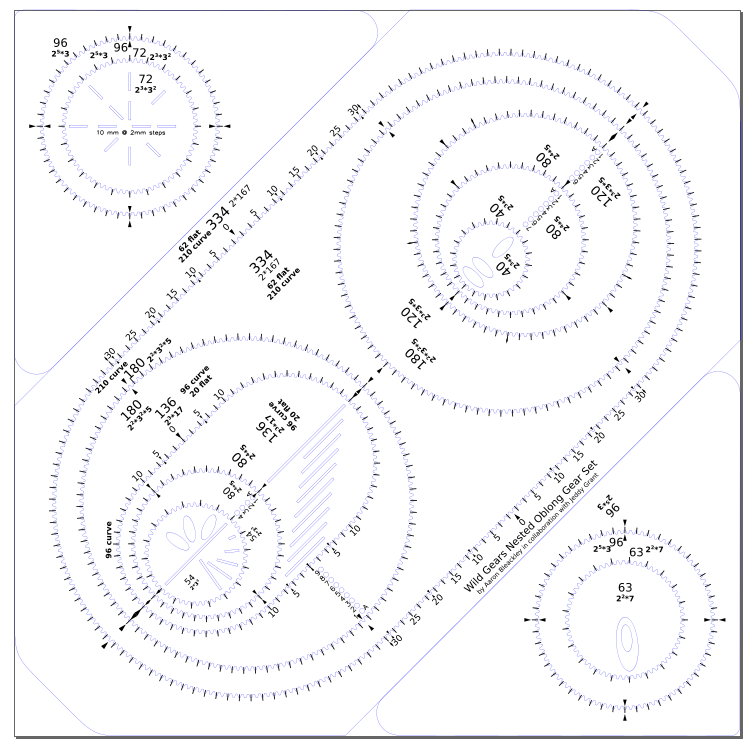
Hello, Lots of big Wild Gears news today! 1) New Gear Set Announcement: Nested Oblong Gear Set 2) Improved Gear Set Lettering 3) Improved Doughnut Pieces 4) Faster Order Delivery 5) Full/Plentiful Hoops Gear Set 6) Version 3 overstock sale 7) Request For Feedback 1) The Nested Oblong Gear Set: This exciting new gear set is designed to explore complex compound designs. New straight gear segments allows for the creations of parallel rack gears. Using a hoop in the rack system gives precise control over positioning and re-positioning pieces. This gear set has an unparalleled number of ways to adjust and control the shape and position of your designs. These new degrees of freedom make creating new compound designs that were previously impossible. It is hard to describe but easy to show this gear set in action. Please take 90 seconds and check out this video on YouTube. (seriously, check out this video. It is beautiful) In the video a hoop is being used in the large oblong. In the hoop is a gear with an off-center cutout and in the cutout is a small gear. Repeating the simple design that the system makes while moving the hoop and the starting point of the small gear creates a piece of art with a sensation of movement and depth. For more excellent pictures of Wild Gears art made with the Nested Oblong Gear Set you can check out the work of my collaborator on this gear set, Jeddy Grant, at: YouTube: @Jeddy Grant Instagram: @spirocat_works Patreon Reddit: /Inksphere/ the r/spirograph subreddit is also a great place to see and post beautiful art. The Nested Oblong Gear Set is not a stand alone gear set. It is designed to be used with other Wild Gears Gear Sets for best effect. It is strongly recommended that you have the Full Page Gear Set as the 210/180 hoop is very useful to have. 2) Improved Gear Set Lettering: Gear Sets now have frosted engraved letters! They are very legible now. This change is the most obvious impact of Wild Gears now being produced in house. New material selection and more laser cutter control allow for new exciting changes; like the improved lettering. The lettering has been re-done on all the gear sets. A variety of other small improvements are also being made to tweak the designs, such as adjusting pen hole placement where it has made pieces fragile. These two photos show the contrast between the new lettering (the frosted white bold lettering) and the hairline lettering. 3) Improved Doughnut Pieces: The plastic doughnuts that make parallel lines possible are wonderful and used to be very hard to tell the sizes apart; they are sized in 1 mm increments. Now the doughnut pieces are colour coded! Each size increment on the medium sized ones (6mm diameter) have there own colour code. For the larger doughnut pieces (9 mm diameter) they repeat the colour code twice. The colours are:
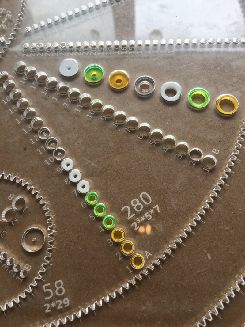 The smallest hole used to be 1 mm but that has been widened to 1.5 mm to accommodate a wider range of fine tip pens. Additionally all the 1mm holes on the encyclopedic gear set have been increased to 1.5 mm to improve usability. All new gear sets will have these new colourful doughnut pieces included as default. Additional cards of doughnut pieces will be available for replacement or supplementation of doughnut piece supply 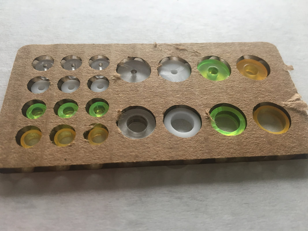 4) Faster Order Delivery: Most orders will now be shipped they day they are placed. Doing in house manufacturing means that a stock of inventory can be maintained. Previously orders took 5 days to make before they shipped. Large orders or during particularly busy times orders may take 2-3 days to ship. 5) Full&Plentiful Hoops Gear Set: In the Full & Plentiful Hoops Gear Set the large shapes of the Full Page and Plentiful Gear Sets have been packed onto one gear set sheet as sets of hoops. This is designed to make them more portable and easy to handle, as well as giving some new hoop combinations. 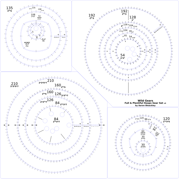 This gear set cuts the large sheet into 4 smaller frames making it much easier to handle each part. The 210/160 hoop also gives more possibilities for using the large oblong in the Nested Oblong Gear Set.
6) Version 3 overstock sale: There are some remaining gear sets from v3 that are for sale for half off or better. Quantities are limited. There are also a couple of v.4 gear sets that have minor imperfections listed too. Act now before they run out. 7) Request for feedback and suggestions: If you have any parts that have broken or other things about Wild Gears that haven't worked well for you, I'd like to hear about it. Send your emails to info@wildgears.com. I'd also like to hear about what you really love about Wild Gears. If you have an idea for a new theme or idea that you'd like to explore that needs gears that don't exist yet I'd love to chat with you about your idea and dream. If I have the time I'll sometimes design new gear sets based on requests and suggestions. Thank-you for your enthusiasm for Wild Gears and for taking the time to read this email, Aaron Bleackley
3 Comments
Sometimes acrylic breaks. It can be fragile when bent and accidents happen. If you get a break in your Wild Gears it can be repaired. This method works best if the broken piece has a break in it rather than being broken into multiple pieces.
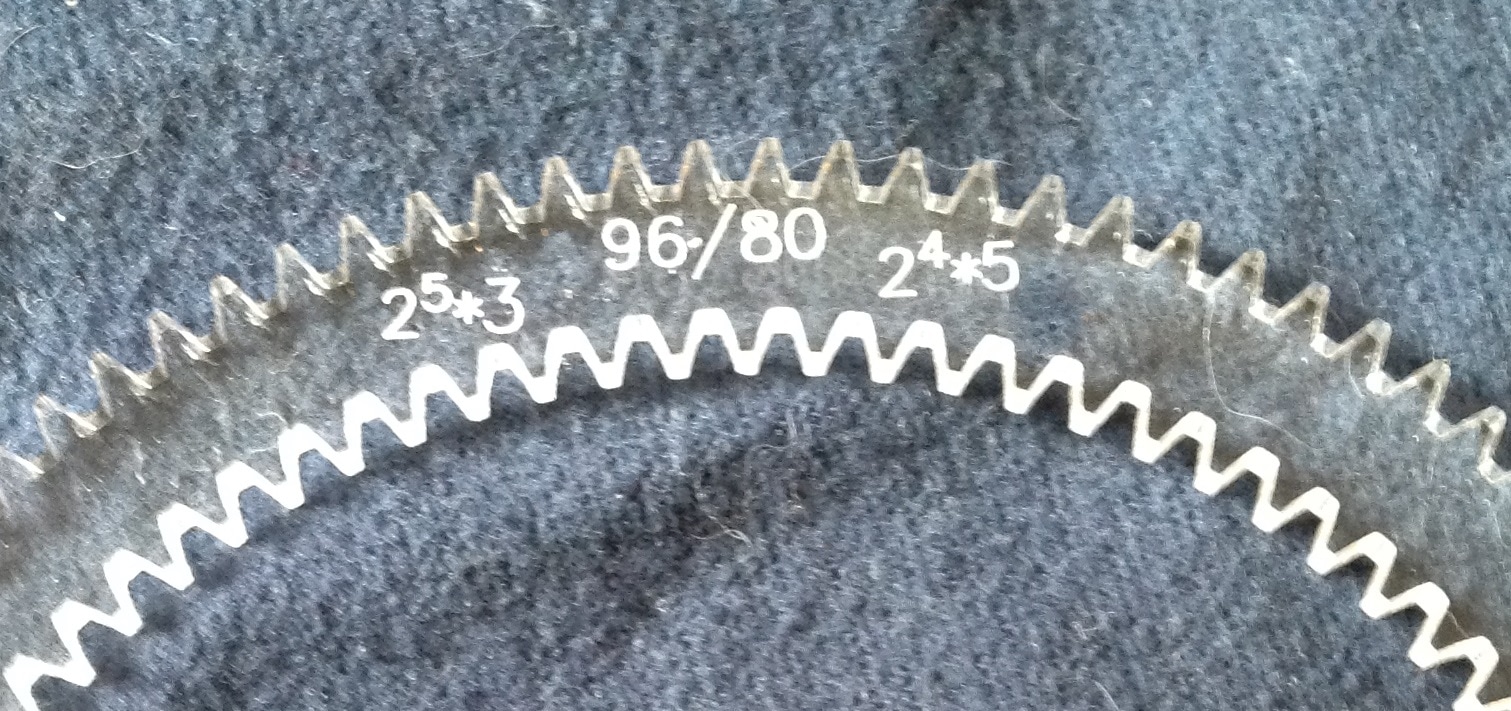
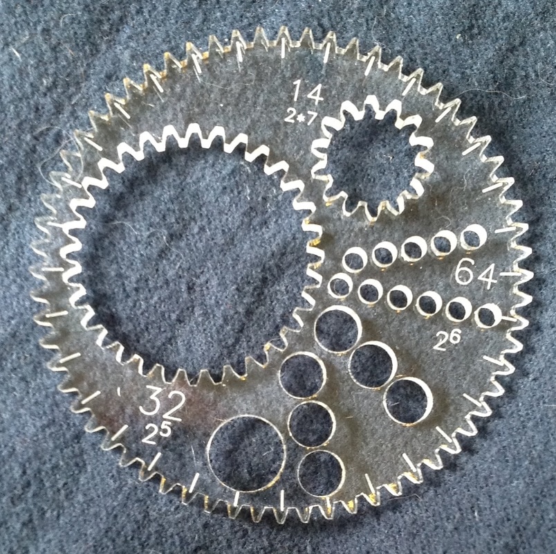
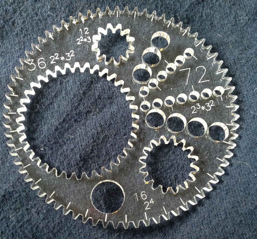
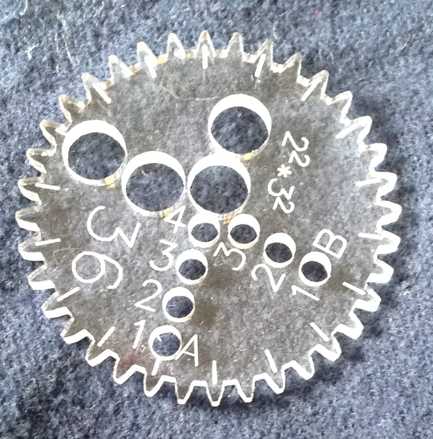
The glue to use is acrylic cement, or superglue should work well too. Use a toothpick or pin to apply a small amount of the glue to the broken face. Then align the break into the flat position you want the glue to cure it. Wipe off any extra glue. Some tape can help hold the pieces together nicely. Read the glue container to learn how long it should take for the glue to set. Be careful not to glue your piece to whatever surface you are working on, like your table, or to yourself. This fix should make the piece usable again but there will be a visible mark where it was broken and glued. Good luck in your mending! Today'll be a quick post about what all the different numbers on the gears mean. Most gears have two sets of numbers and non-circular gears have three sets. 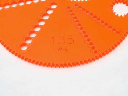 The biggest number is the tooth count of the gear. This is a measure of the circumference and is helpful to know when making design choices. Most gears also list the prime factors of the tooth count. Prime factors help predict how many lobes/petals/points a design will have. In the picture above the tooth count of the gear is 135 and the prime factors are 3^3*5 (3*3*3*5). Some small gears have the tooth count as their only number due to space constraints. Prime factors will still be listed where the number is engraved beside the ring. Some gears have a prime number of teeth and therefor don't have any factors to list. 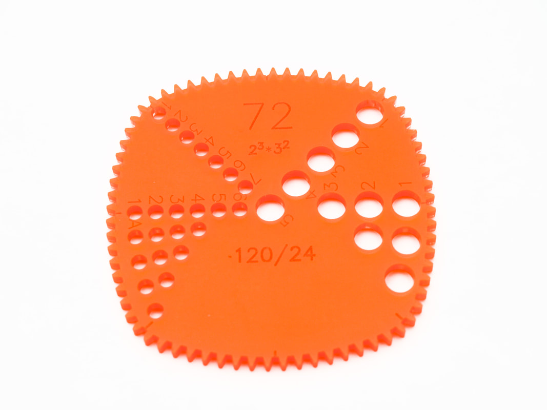 The numbers on the non-circular gears will be written as 'big number / small number' ( 120/24 for example). These numbers tell you about the different parts of the non-circular gears. These gears are constructed from arc-segments of different sized circular gears. A triangular gear that was 120/24 means that the flat 'sides' are made from part of a 120 tooth gear and the corners are made from part of an 24tooth gear. This is important to know because the resulting triangle gear will not work properly in a ring that is smaller than 120 teeth and the triangle ring will only work with gears that have fewer than 24 teeth (bigger ones will get stuck in the corners). There is also hoops which have an inside and outside tooth count. 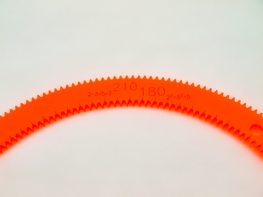 In the picture above the outside of the hoop has 210 teeth and the inside has 180 teeth. The prime factors of each are listed beside. On some hoops the tooth counts will be listed separated by a slash (210/180) due to limited space.
Additional note: Pen hole numbering Pen holes come in 4 sizes: small, medium, large, and extra small. Small pen holes are on every gear and have a diameter of 3 mm, medium pen holes are on most gears and have a diameter of 6 mm, large pen holes are on some gears and have a diameter of 9 mm, and extra small pen holes are rarely seen on very specific gears and have a diameter of 1 mm. Each line of pen holes is numbered starting at 1 at the edge of the gear and counting up until the line ends. Lines of the same size are marked with A, then B, and so on. Line A starts closer to the edge of the gear than line B. The distance between A1, B1, and A2 are the same; this allows placing more equally spaced pen holes on the gear than one line could hold. Non-circular gears also have 'side' and 'corner' pen holes to distinguish between. Using the little cylinders ('doughnuts') that go into the medium and large holes can yield a wide variety of results. This post is a starting point for developing further techniques. Gear Sets come with a range of sizes of the doughnut pieces with each one provided with some duplicates; recognizing how easy they are to lose. The multitude of them can make it hard to determine how many sizes there are and what size any one piece is. When I start using the doughnut pieces I'll line them up by size, removing ones that I can recognize to be of the same size. To calibrate the doughnuts take a simple ring-gear combination (72:36 for example) and start with the doughnut with the biggest hole and make the design. Switch colours; ideally to a lighter one, black to red is very good for this. Using the lighter colour and the next doughnut piece in the line repeat the design. If it is the same size then the red line will not show up as it is directly on top of the black line. If it is a very little bit different the red line will show up very close to the black line. Depending on the pen type there may be no white space between the two lines. If the size difference between the pieces is larger there will be a blank pinstripe gap between the two lines. This process can be repeated to calibrate the sizes between all the doughnut pieces in the line; sorting them by size and removing any duplicates as well as informing the relative step sizes between them. Note: Using different brands of pens will yield different line positing too. For this calibration step use two pens of the same brand, or stick to just one pen.  In this photo I have finished the calibration step and selected 4 different sized doughnut pieces. I have them lined up so that I don't get confused. I've selected colours to go with each step and you can see that black and red are aligned with a 5th blank step that corresponds to using the medium pen hole without a doughnut piece. The picture below was made using 72:48 1B (+4Hoops), (12 CCW) 2B (+4Hoops) where 1B used Black, Blue, Dark Blue, Purple, and Red and 2B used Red, Orange, Yellow, Light Green, Dark Green.  Notice that the pen lines and colours are each distinct but have not white space between them. Because these pen colours overlap just a bit the stronger colours dominate and the central lines look narrower. Depending on pen line weight it is possible to use this effect to make a narrow pinstripe of colour down the middle of a black line by sandwiching a line (I like red or gold for this effect) between two heavy black lines. More space can be made for each individual line and colour by choosing doughnut pieces that provide more space, like in this next example. 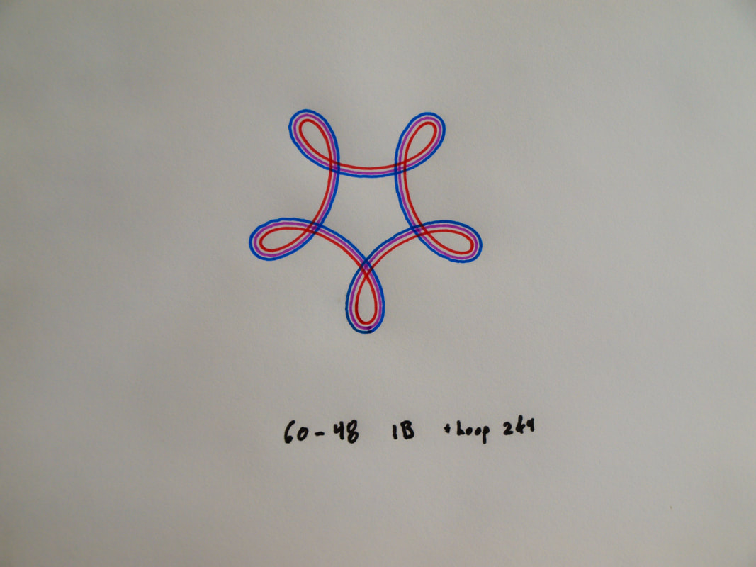 These are the core techniques of how to determine the spacing provided by the doughnut pieces and some different ways to begin using them. By experimenting with spacing, colour, and line weight you can create incredibly diverse and powerful variations on a design.
The tightly packed parallel lines made by the doughnut pieces also appear different at different distances. Quite some time ago I made a design that was composed of a tightly packed set of these lines that played to tartan inspired colours and and spacing. Much to my surprise, at a distance it looked more like a beige design but it caught the eye in a hard to describe sort of way. When approaching the piece I would cross a some critical distance and all the individual colours in ti would snap into focus and it would suddenly appear colourful. I'll try and find this piece and share it in a future post, but I have no idea how to capture this feeling of it photographically. Thank-you for reading. Have fun! Aaron Bleackley I've been making my own shorthand notation for how I made designs for several years now and slowly refining it. This post can be a starting point in trying to codify any of it. Hopefully this will be the start of a useful shorthand. Today, I'll lead with the picture and we can work from there. 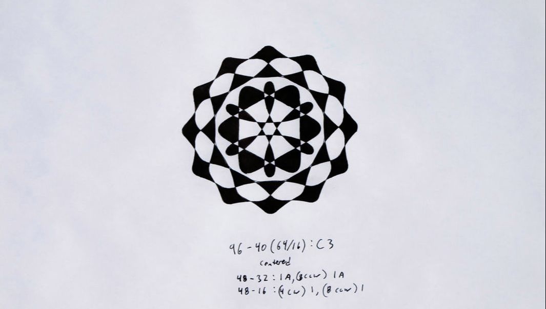 I made a complex piece using several designs layered on each other. Lets start with a copy of the notation below the design and then I'll break down what each part means and why it is structured the way it is. Hopefully this description will enable you to make use of the notation for yourself if you are so inclined. 96-40(64/16) : C3 centered 48-32: 1A, (8 CCW) 1A 48-16: (4 CW) 1, (8 CCW) 1 There are four lines; each giving information about a different stage of the design.
These steps form the lines of the design. I then coloured it in a checkerboard pattern starting by colouring all the outer cells and alternating on my way into the center of the design. 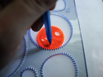 This picture is a visual reference for the 6 O'clock starting point described in step 3. In this case it would be for the design 72-42: 2A.
This is a starting point for developing a broader notation involving more details and types of designs. This should prove to be a robust starting point for gear-in-ring style designs. Previously I've posted pictures and videos to various parts of the internet highlighting interesting, pretty, and often complex designs that I've made with Wild Gears. I'd like to make a slightly different space for posts and pictures that talk about different techniques of using Wild Gears. This will start building a knowledge base for people to bring to their own creativity and exploration. I'm going to start simple and short with a few pictures and hopefully not too many words. Today's topic is pen angle. When starting to use Wild Gears the aim is usually to make clear crisp lines and uniform designs. This is best achieved by holding the pen vertically; rather than angled like is more common when writing. Applying consistent pressure and speed is also good (some pens need that much more than others). The first trick to get a better looking line is to go over the design two or three times. This gets a solid ink line that looks bolder and crisper. It also helps hide the point where the design started and stopped. Now that you've got the hang of making solid consistent lines thought complex designs lets look at how to add subtle body and emphasis to the lines. A lot can be done by tilting the pen while going over the design an additional time. The key is to be aware of how and when the pen is tilted. For example tilting the pen consistently to the left will give a different line weight pattern than tilting the pen towards the center of the ring at all times. This picture shows a very simple design that has been done three ways.
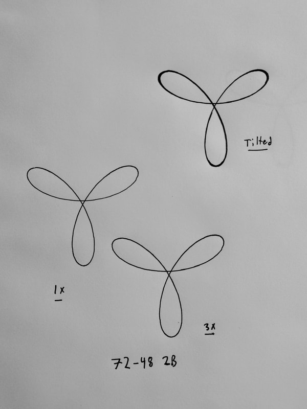 The 1x design looks similar to the 3x design but the 3x design is more bold and stands out better but both have uniform line thickness. The top right design 'Tilted' shows off narrow lines near the center and thicker swooping lines near the edges. The top right lobe is the best example.
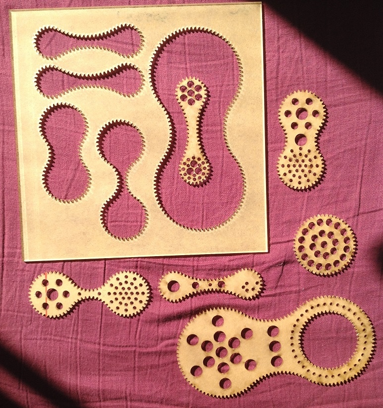
Clearly, these photos also need better lighting to do them justice but for now it is good to be getting started. If you have questions, comments, or want more details about pen angle, I'd love to hear from you. Thank-you for reading, ~Aaron Doing some spring cleaning and organization led to a discovery of two Strange Shapes Gear Sets V2. If you want a Strange Shapes Gear Set for half the regular price act now! (supplies are limited) Note: These are version 2 Strange Shapes Gear Sets (V3 is current). They have all the same parts but lack the hatch marks around the edges of the gears as well as the numbered pen holes and the prime factors listed on each piece. 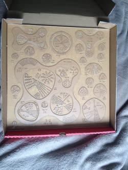 The gear set in the picture has had some of the brown paper layer removed from one side to make the pieces stand out better.
I often get asked about how to store and organize wild gears; especially the large sets. There are many creative and wonderful ways that people have shared with me that they have come up with. Perhaps I'll collect some of them for another post in the future. But right now I want to tell you about the simplest storage solution that I have found. Pizza boxes. Wait, clean pizza boxes. The pizzeria down the street will sell me pizza boxes for $0.50 each. I got an extra large pizza box and it holds large gear sets very well. Large Gear Sets are 15 inches, and small gear sets are 7 inches. You can probably even get blank pizza boxes somewhere if you look around. Cardboard is light, durable, and easy to decorate. I like this solution, and will probably employ it for several of my gear sets because it lets me stack, label, and organize things and I really like the low profile boxes for not taking up more space than is needed. 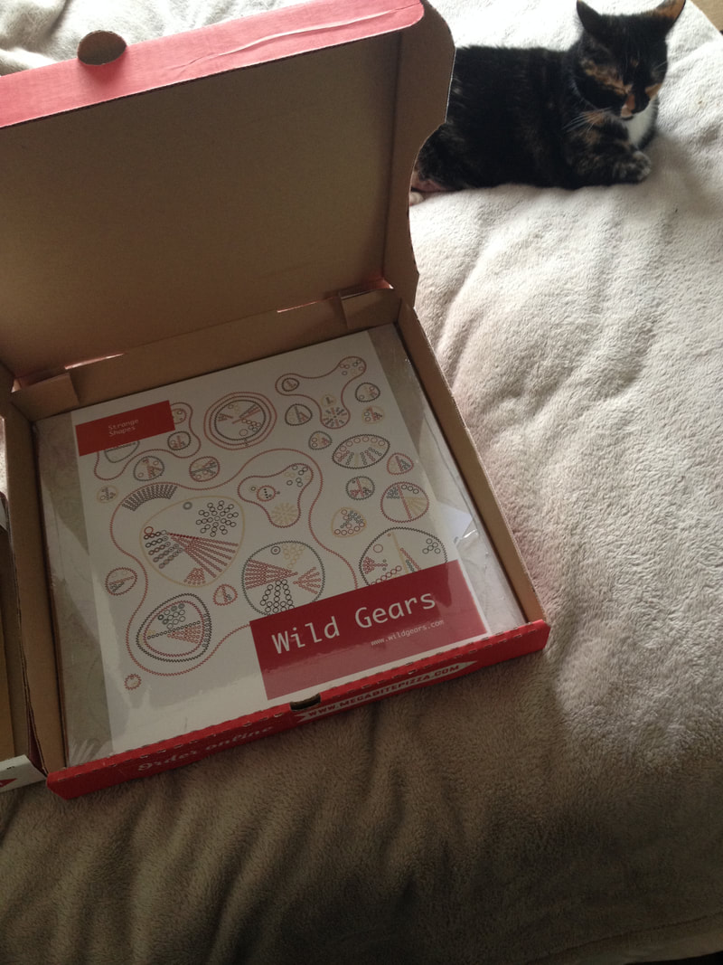 Bonus cat (Echo) for scale. Echo was being very sweet as I shared her spot in the sun for this photo.
Hello Wild Gears Fans!This has been a busy, hectic week for me but I got the Kickstarter page done.
It turns out that Kickstarter has a review process that is either new, or I totally forgot about. It takes up to 3 days so I might not be able to launch the campaign until the 14th. Here is a preview link to the campaign: https://www.kickstarter.com/projects/465068187/2070030585?token=87a2437b I'm pretty sure that I can still make edits to the campaign while waiting for the review so if you have any suggestions I'd love to hear them so that I can make this even better before it launches. I'll definitely be giving the page a once over this weekend to find things to tighten up and improve. The plan is to launch as soon as I get the review done (sometime on the 14th). I'll send out another quick note when that happens. Thank-you, Aaron Bleackley Hello Wild Gears Fans! Today I want to give you some initial details about the upcoming Wild Gears Kickstarter and some of the new features that are in development. I have set an ambitious goal to launch Wild Gears Kickstarter by the end of next week. I am going to try my best to hit that goal but only time will tell. Wild Gears 3.0 Kickstarter will be raising funds to allow for another round of improvement on existing gear set designs as well as launching some new gear sets. Wild Gears is continuing to grow and I hope that in the future general sales of Wild Gears will support ongoing development and improvement but it isn't there yet so I will once more turn to crowd funding and enthusiasm to help improve and expand on Wild Gears. Initial work on the Compact Gear Set has been prototyped to test out different design changes and improvements. I am very happy with how well this initial round of prototyping has gone and in working with it I've discovered more improvements that I want to implement. Some of the improvements that will be made to all the gear sets include:
  Little errors on some of the gear sets will be corrected; a misplaced pen hole, a missing gear set name, or a thin weak section of a part will be thickened. A new type or 'size' of gear set will be introduced. I currently call them Adjunct Gear Sets but may select a better title for the Kickstarter launch. Adjunct Gear Set are the same size as Small Gear Sets and explore a small theme. The two Adjunct Gear Sets that are in development are the Triangle Hoop and Ruler gear sets. 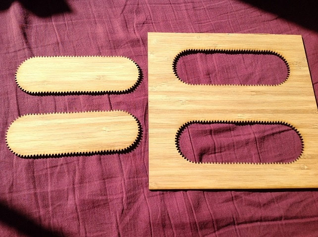 The Triangle Hoop Gear Set explores adding a triangular gear into a set of rings so that one can explore 3 gear systems with a non-circular gear in the mix. 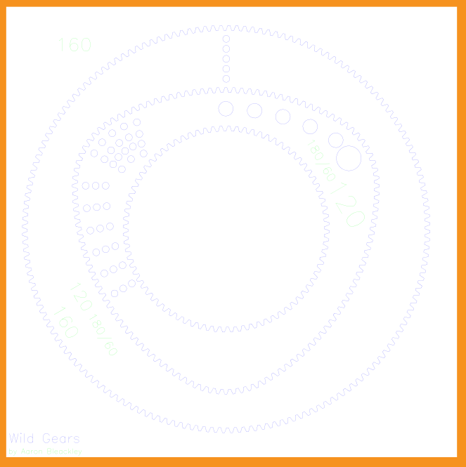 The Ruler Gear Set is two almost strait ruler like pieces. They have a slight wave to them to keep it interesting. Also, yes these prototypes are cut from wood. It is a beautiful option that I am exploring the durability of. 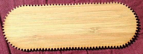 Due to their simpler design and less laser cutting required the adjunct gear sets will be less expensive than Small Gear Sets. The Wild Gears Kickstarter will feature some new gear set options available as part of the base funding goal or as a stretch goal. Adding new gear sets as a stretch goal has a few desirable features from a designer point of view. My main goal of this Kickstarter campaign is to cover the majority of the prototyping costs for the new version of Wild Gears. I have a good handle on how much that is likely to cost so I can make an ambitiously low funding goal which increases my odds of raising the funds. Making new Gear Sets is more uncertain and takes more iterations on the initial prototype so it costs more and has more uncertainty. Both of those traits require raising more funds. The reason I am pushing to launch the Kickstarter campaign for next week is that I want to be able to deliver the backer rewards in time for Christmas and working that time line backwards means that I have enough time to complete the project if I start very soon. I could delay by a few weeks but that would cut into the number of rounds of revision I would be able to do. I don't want to rush the design and improvements so I'm buckling down now to get this show on the road. As with the Wild Gears 2.0 kickstarter all backer rewards will be offered at some discount below regular price. There will also be a limited number of early bird backer spaces that will offer a greater discount on all gear sets. No-matter when the Kickstarter launches I will send out a short newsletter the day before with launch details so that everyone who wants to get an early-bird pledge level can get one. Some of the new gear sets / ideas that I am contemplating for this campaign are as follows:
 More material options may be available. I experimented with two colour gold-black acrylic. It is gorgeous and shows the engraved writing very well. However it only comes in 1.5mm thickness so I'll have to test it a bunch as I anticipate that it'll be harder to use. 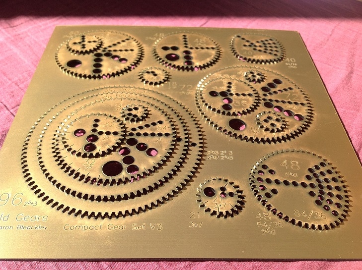 Thank-you for taking the time and interest to read this newsletter. It ended up being way longer than I expected; I guess there is a lot of exciting news :-) If you have something to say, I'd love to hear from you. Now is the time for any suggestions or feedback to have an impact of the next version of Wild Gears. Thank-you, Aaron Bleackley |
AuthorAaron Bleackley, designer of Wild Gears Archives
October 2023
Categories |
Wild Gears
BLOG and
BLOG and
Newsletter


 RSS Feed
Proudly powered by Weebly