|
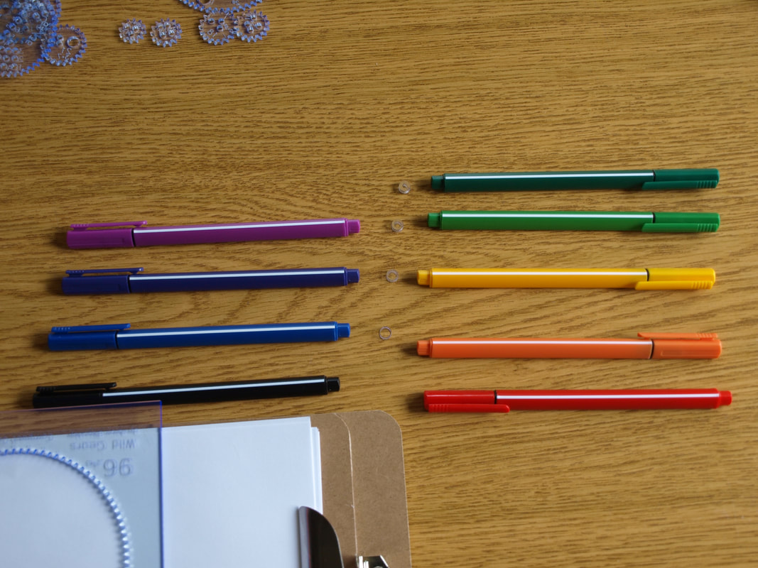
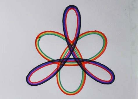
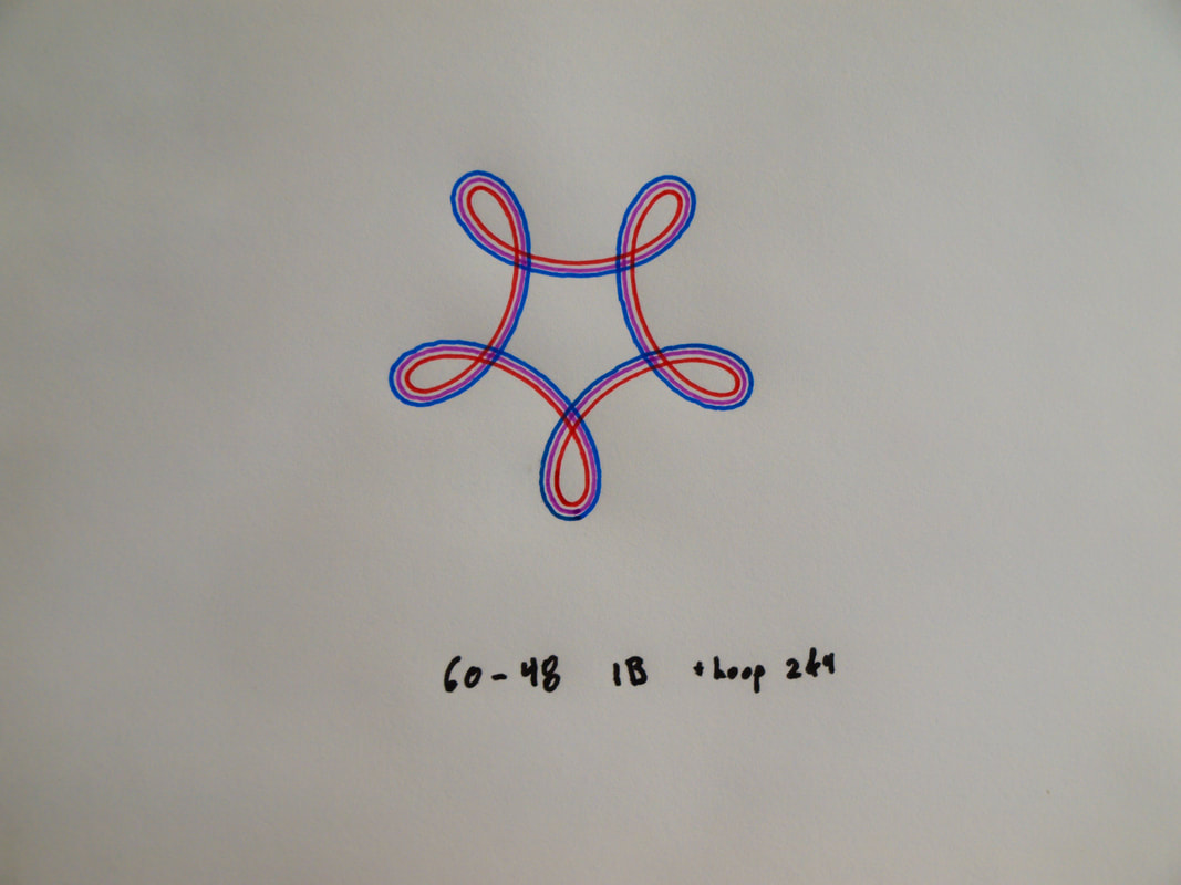
Using the little cylinders ('doughnuts') that go into the medium and large holes can yield a wide variety of results. This post is a starting point for developing further techniques. Gear Sets come with a range of sizes of the doughnut pieces with each one provided with some duplicates; recognizing how easy they are to lose. The multitude of them can make it hard to determine how many sizes there are and what size any one piece is. When I start using the doughnut pieces I'll line them up by size, removing ones that I can recognize to be of the same size. To calibrate the doughnuts take a simple ring-gear combination (72:36 for example) and start with the doughnut with the biggest hole and make the design. Switch colours; ideally to a lighter one, black to red is very good for this. Using the lighter colour and the next doughnut piece in the line repeat the design. If it is the same size then the red line will not show up as it is directly on top of the black line. If it is a very little bit different the red line will show up very close to the black line. Depending on the pen type there may be no white space between the two lines. If the size difference between the pieces is larger there will be a blank pinstripe gap between the two lines. This process can be repeated to calibrate the sizes between all the doughnut pieces in the line; sorting them by size and removing any duplicates as well as informing the relative step sizes between them. Note: Using different brands of pens will yield different line positing too. For this calibration step use two pens of the same brand, or stick to just one pen. In this photo I have finished the calibration step and selected 4 different sized doughnut pieces. I have them lined up so that I don't get confused. I've selected colours to go with each step and you can see that black and red are aligned with a 5th blank step that corresponds to using the medium pen hole without a doughnut piece. The picture below was made using 72:48 1B (+4Hoops), (12 CCW) 2B (+4Hoops) where 1B used Black, Blue, Dark Blue, Purple, and Red and 2B used Red, Orange, Yellow, Light Green, Dark Green. Notice that the pen lines and colours are each distinct but have not white space between them. Because these pen colours overlap just a bit the stronger colours dominate and the central lines look narrower. Depending on pen line weight it is possible to use this effect to make a narrow pinstripe of colour down the middle of a black line by sandwiching a line (I like red or gold for this effect) between two heavy black lines. More space can be made for each individual line and colour by choosing doughnut pieces that provide more space, like in this next example. These are the core techniques of how to determine the spacing provided by the doughnut pieces and some different ways to begin using them. By experimenting with spacing, colour, and line weight you can create incredibly diverse and powerful variations on a design.
The tightly packed parallel lines made by the doughnut pieces also appear different at different distances. Quite some time ago I made a design that was composed of a tightly packed set of these lines that played to tartan inspired colours and and spacing. Much to my surprise, at a distance it looked more like a beige design but it caught the eye in a hard to describe sort of way. When approaching the piece I would cross a some critical distance and all the individual colours in ti would snap into focus and it would suddenly appear colourful. I'll try and find this piece and share it in a future post, but I have no idea how to capture this feeling of it photographically. Thank-you for reading. Have fun! Aaron Bleackley
2 Comments
10/31/2022 11:07:19 pm
It is still important to cleanse your face as you get older, as it removes traces of chemicals from your environment or any makeup which can cause aging if left on the skin.
Reply
Leave a Reply. |
AuthorAaron Bleackley, designer of Wild Gears Archives
July 2024
Categories |
Wild Gears
BLOG and
BLOG and
Newsletter
Proudly powered by Weebly


 RSS Feed